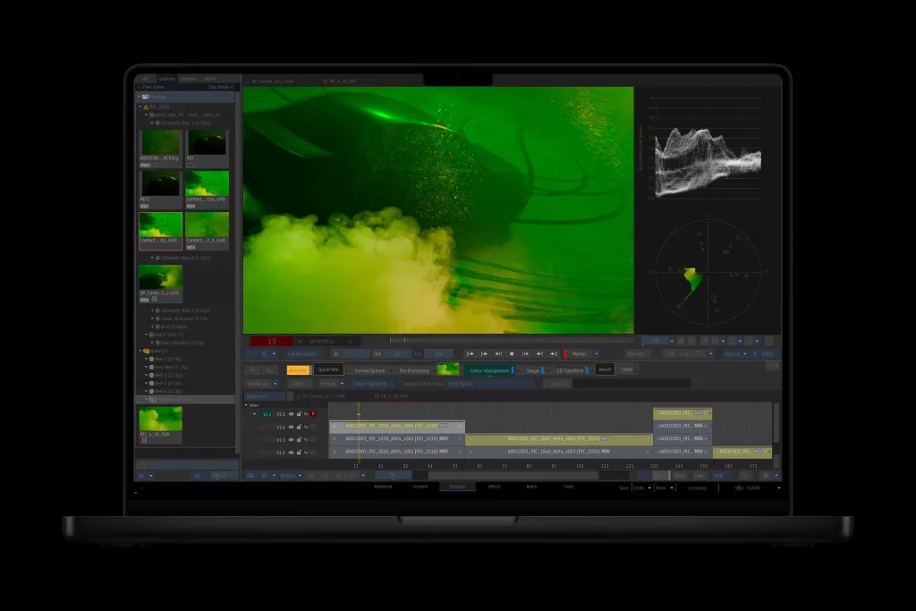
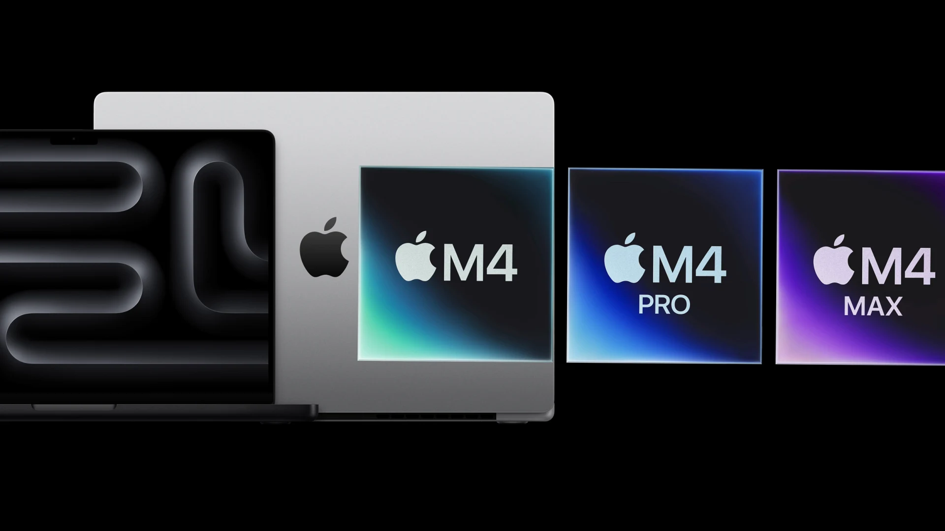
Apple gave me an advanced look at its newest flagship laptop, the 16-inch M4 Pro MacBook Pro, which goes on sale to the public tomorrow. I was interested in giving it a test run, of course, but aside from expecting speed increases, thanks to the M4 Pro chip, I honestly wasn’t expecting to be too wowed. MacBook Pros are usually always the best laptop on the market anyway—and this one, on the surface, didn’t seem much more than a spec update over last year’s M3 Pro models.
Boy, was I wrong. Within minutes of using the M4 Pro MacBook Pro, I understood one thing: It would be hard to go back to using any other laptop—Apple or not—after this. And that feeling has only solidified over the course of the week that I’ve been using the new flagship device.
The nano texture display is a work of art
Apple sent me the 16-inch model in Space Black with the M4 Pro chip, 2TB of storage, and 48GB of memory. But it also came with one more thing: the optional nano-texture display. It is this display that made me fall in love with Apple’s latest laptop.
The “nano texture display” is the name Apple has given to its new matte screen option for the MacBook Pro, which features the 16.2-inch Liquid Retina XDR display, which has a refresh rate of up to 120Hz. It marks the first time you can get a matte display option on the MacBook Pro in more than a decade. The advertised advantage of the nano display, which costs an extra $150, is that it reduces glare—important if you work in an office with overhead lights, or if you enjoy working outdoors in bright sunlight (the 16-inch MacBook Pro also now features up to 1000 nits of brightness for SDR content, making your screen appear brighter in sunlight).

With the nano texture display option, the MacBook Pro’s screen has finally been freed from the reflective plexiglass prison it has been trapped in. Whether I was working indoors or outdoors, there was never any kind of glare on the screen. This meant that I didn’t have to adjust the MacBook to avoid being under harsh overhead lights, nor did I have to look for a shady area when sitting outside with it at a cafe.
But the lack of glare isn’t even the nano texture display’s best quality. That would have to be the way it looks. It’s hard to describe this, because you really need to see it to understand. The closest I can come to describing it is that it doesn’t “feel” digital. It’s smooth and bright and has even colors, like most displays do, but it looks more like an organic canvas, a beautiful living tapestry in which the physical manifestation of light resides.
I realize that those are weird phrases to use in a tech review, but it’s the only way I can convey just how beautiful the nano display option on the new MacBook Pro is. For me, it is the killer feature of the new M4 MacBook Pro series—and I will be angry with Apple if the company doesn’t bring the nano display option to its iPhones and MacBook Air lineup.
