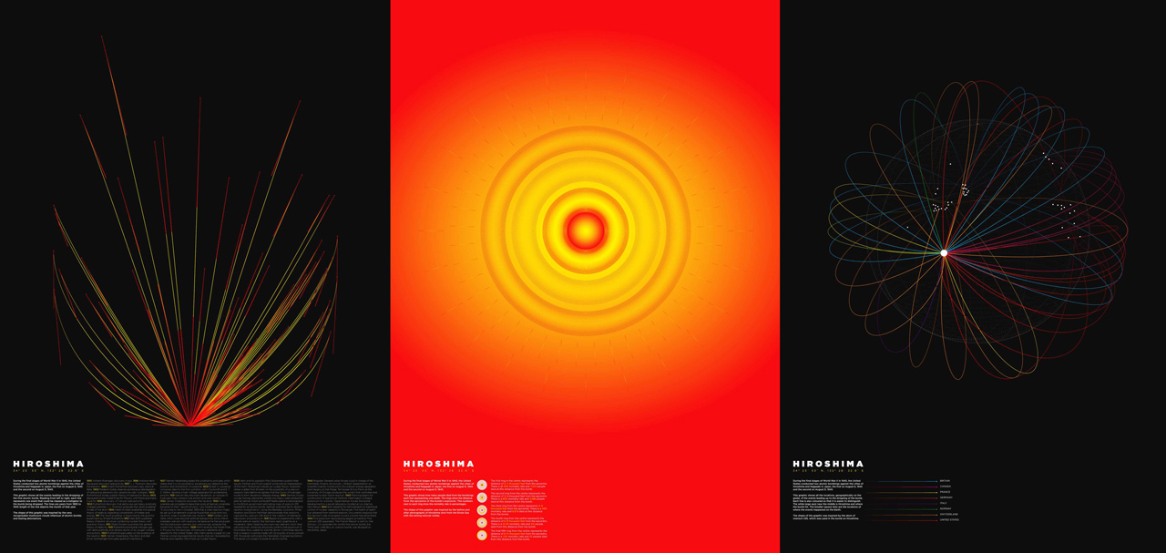
70 years ago, the United States dropped the first nuclear bomb on Hiroshima, killing anywhere from 90,000 to 166,000 people in the process. Graphic artist Mathew Lucas created a series of visualizations to, as he explained to PopSci, “highlight” the events.
The work is unique for sure. The first piece is basically a reverse-blooming timeline, in which several events (from the discovery of X-rays to the development of plutonium) converge into a single point that is the first atom bomb. The second charts the bomb’s casualties in relationship to the blast radius as the glowing reticle from the Enola Gay. The final piece depicts the global research on the atomic bomb, which converges, as a Uranium-235 atom, onto Hiroshima itself.

It’s attractive, intelligently rendered work. And at the same time, it feels off. When data researcher Kate Crawford brought up the visualization on Twitter, she sparked a critical conversation between some of the most respected names in the field today. Jer Thorp, a data viz specialist who worked on the National September 11 Memorial & Museum, chimed in first.
But then data researcher Moritz Stefaner shifted the topic, asking, is the core problem here really just one of aesthetics? Can a data viz on a tragic topic not make attempts at graphic cleanliness, or even beauty?
That prompts Kim Rees, co-founder of Periscopic–the firm that created the de facto horribeautiful gun death visualization referenced by Stefaner, chimes in with the real lesson of the day.
The Hiroshima visualizations by Lucas bother us, not just because they’re a beautiful depiction of a horrific event, but because they’re ultimately an insensitive one, more invested in their own clever, aesthetic mechanics than actually bringing some level of new insight to the tragedy.
I have no special, new understanding of Hiroshima thanks to Lucas’s gorgeous work. And that makes me, as a viewer, feel complicit in its self-absorption.