One of the biggest challenges for small nonprofits is getting noticed. A great logo and snappy website can make organizations look more professional and help explain their work, attracting more donors and partners. But existing donors don’t really like to pay for that kind of stuff—even if it might eventually benefit everyone.
For that, you can blame the sector’s so-called Overhead Myth—a wrong-headed belief that limiting operating costs means groups can allocate money with more effectiveness to cause work. In reality, it just strangles their ability to expand and improve services with better backend support.
To help solve that, Wix, the website-building platform company, spent the summer teaching a mix of recent design school graduates and early and mid-career professionals some new tricks to revamp their portfolios. One of the major projects included partnering with several New York nonprofits in need of a digital facelift. The program included 40 participants from the U.S., Europe, South America, and Asia.
“It’s three months of web design where we teach web design in a holistic manner,” says Vuong Tong, the head of Wix Playground, the company’s exhibition space in New York. That includes covering the basics around how to share editorial content and photography and smart layout, as well as how to deploy animation, illustrations, and motion graphics effectively. This summer’s class then practices those principles by revamping sites for 15 local nonprofits.
The overhauls included logo redesigns as part of larger rebranding and reorganization efforts. “We find that if you just revamp the logo, then the project sort of falls short on the lasting impact and the business needs that the nonprofit’s actually trying to solve,” Tong says. The goal is to think about what the site needs to accomplish first, pinpoint the personality or tone of how it will do that, and then create something iconic that matches those efforts.
Here’s a look at three of the overhauls with substantial logo changes:
FLEX
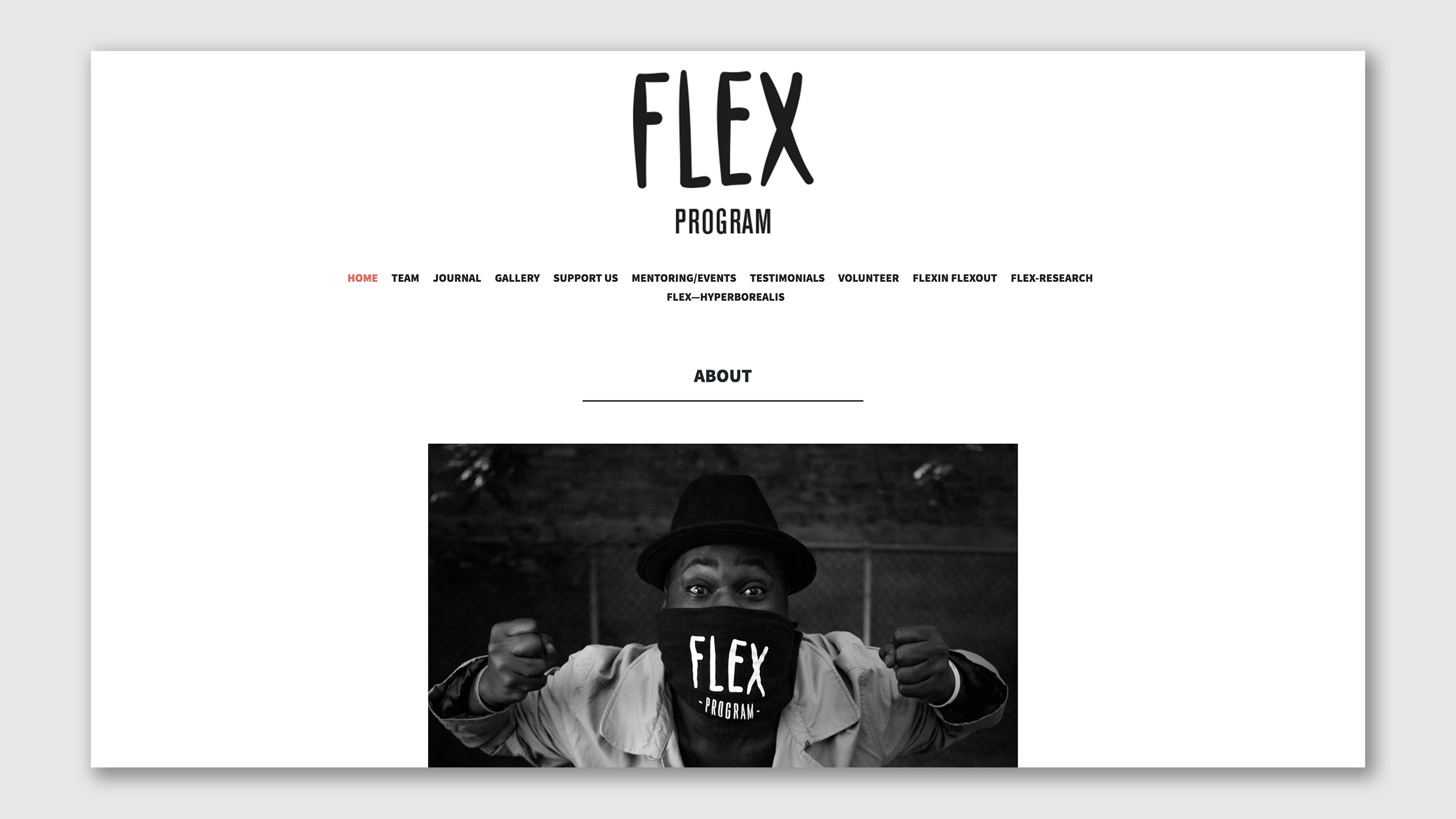
Flex is a nonprofit that offers free dance and mentoring sessions to kids in detention centers and foster care programs. Its goal is to help them find a positive outlet for emotional expression and to promote creativity while building self-esteem. The initial logo was just the group’s name written in relaxed capital letters. It didn’t telegraph much about the program—a problem that was complicated because the website’s landing page started out with a vague picture of a man doing some sort of theatrical performance near a menu that was stuffed with options: an online journal, galley, and testimonials, none of which transmitted the central mission.
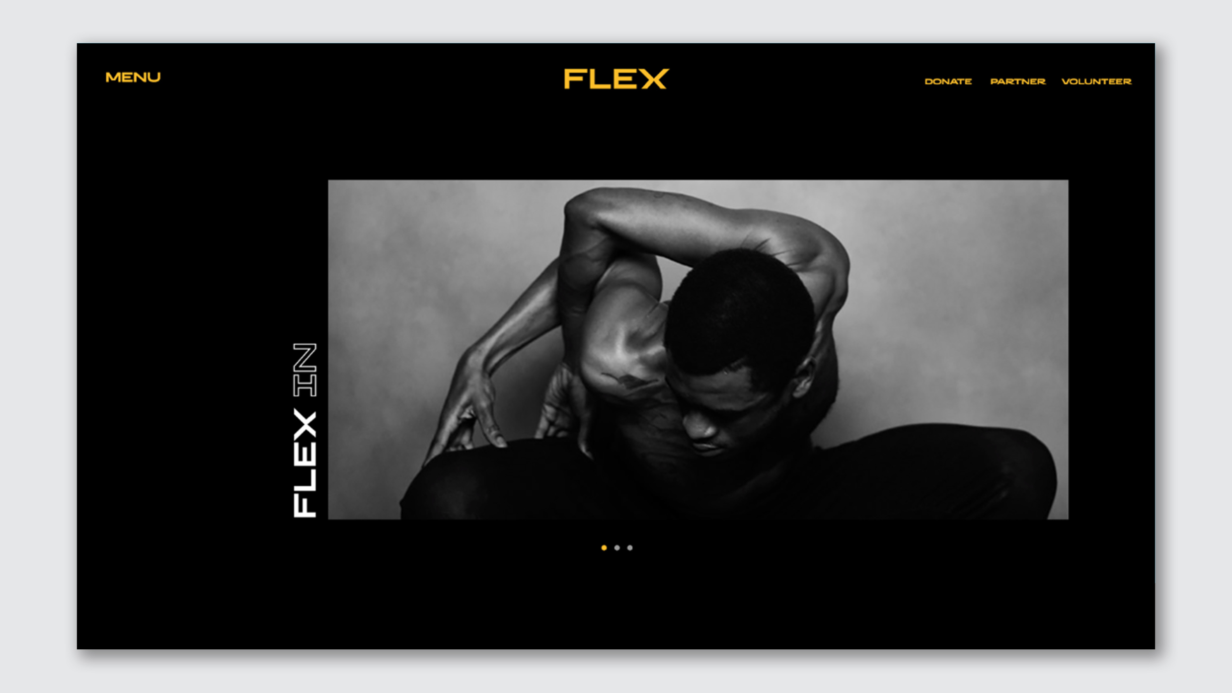
To mainstream the message, WIX’s team decided to focus on telegraphing Flex’s mission, their style of dance, and how people can join or support the group. That includes a striped down landing page with the group’s name in sharper gold lettering meant to approximate some of the poses being struck. “The [style of] dance is categorized with the sharp angles and a lot of movement with the arms and hands. So we try to make that as reflective as possible,” Tong says.
HEROINES
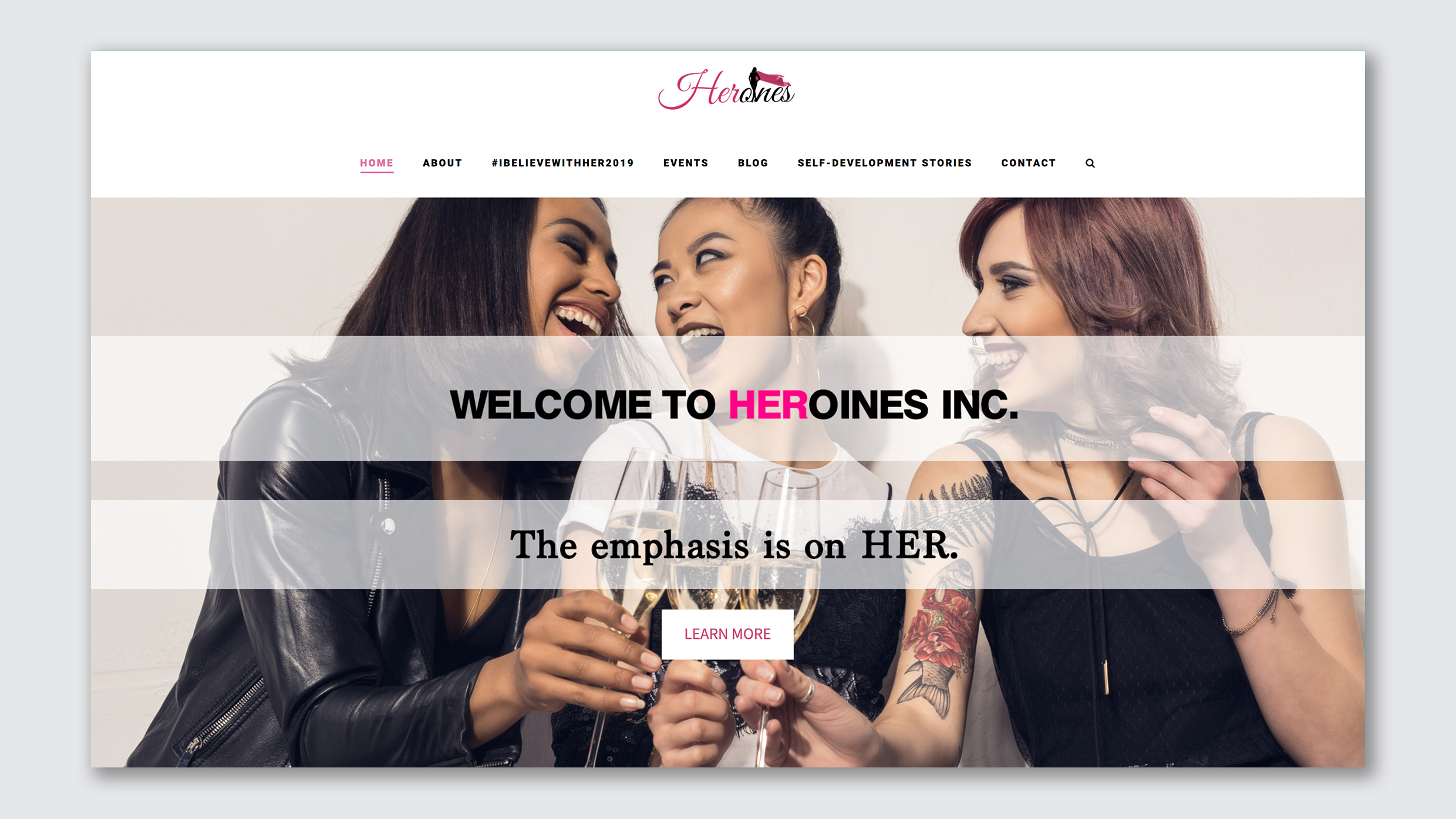
Heroines is a nonprofit that encourages young women, especially in the Bronx and Staten Island, to connect and support each other. That includes hosting different social events designed around games or activities that spark conversations and encourage sharing. The previous site didn’t highlight the upcoming events, making it hard to participants to plug in. The logo was overcomplicated with italics, a two-tone color scheme, and part of the group name replaced by a capped silhouette.
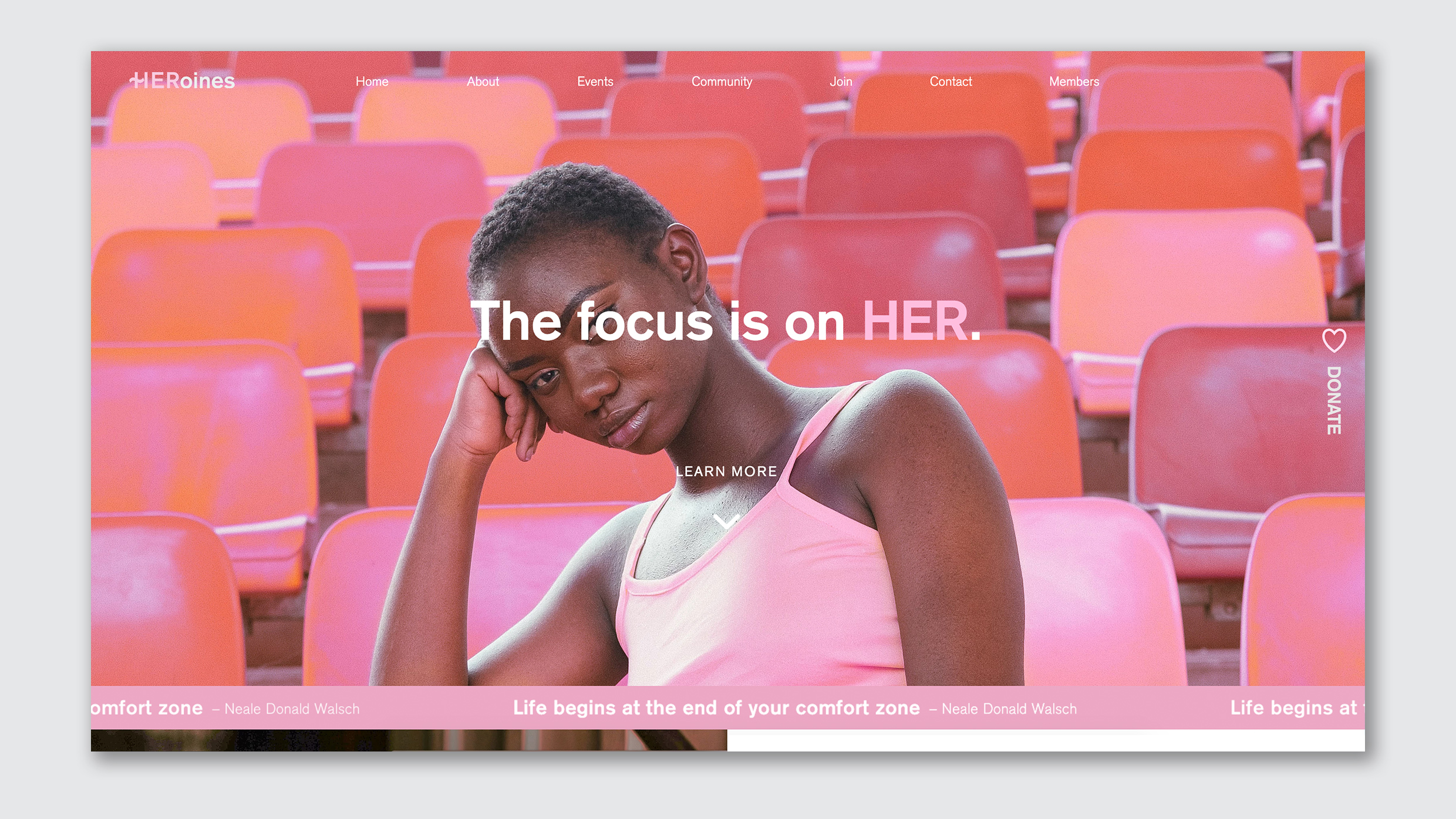
The Wix redesign makes the wordplay in the group’s name more clear by placing an image of its typical attendee in the center of the page alongside bolded script that reads “The focus is on HER.” The capitalization of that last work is repeated in the logo with a slightly stylized “H” to represent the previous cape aesthetic. Most importantly, there’s a clear events tab at the top of the page. “We wanted to keep that same sense of heroism and boldness, but then do that in a sort of much simpler and impactful and memorable way,” he says.
GLOBALIZING GENDER
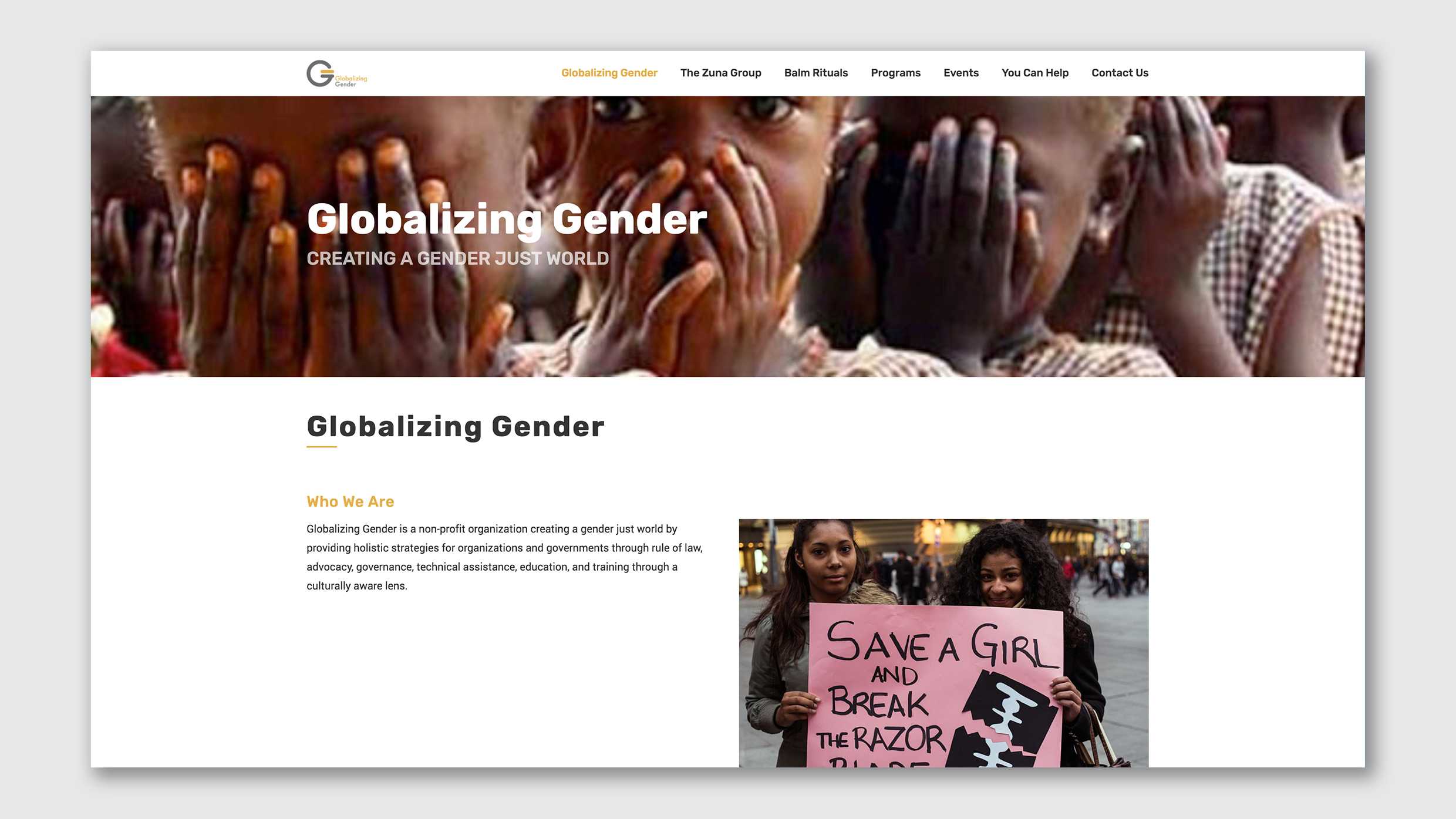
Globalizing Gender is a nonprofit that works toward women’s equality by advocating for a variety of local, national, and international protections and policies that cover everything from preventing human trafficking to stopping child marriage and female genital mutilation. The group’s logo of two overlapping Gs echoes some issues throughout the old site, which promoted gender justice without making the underlying strategy it was working on immediately clear.
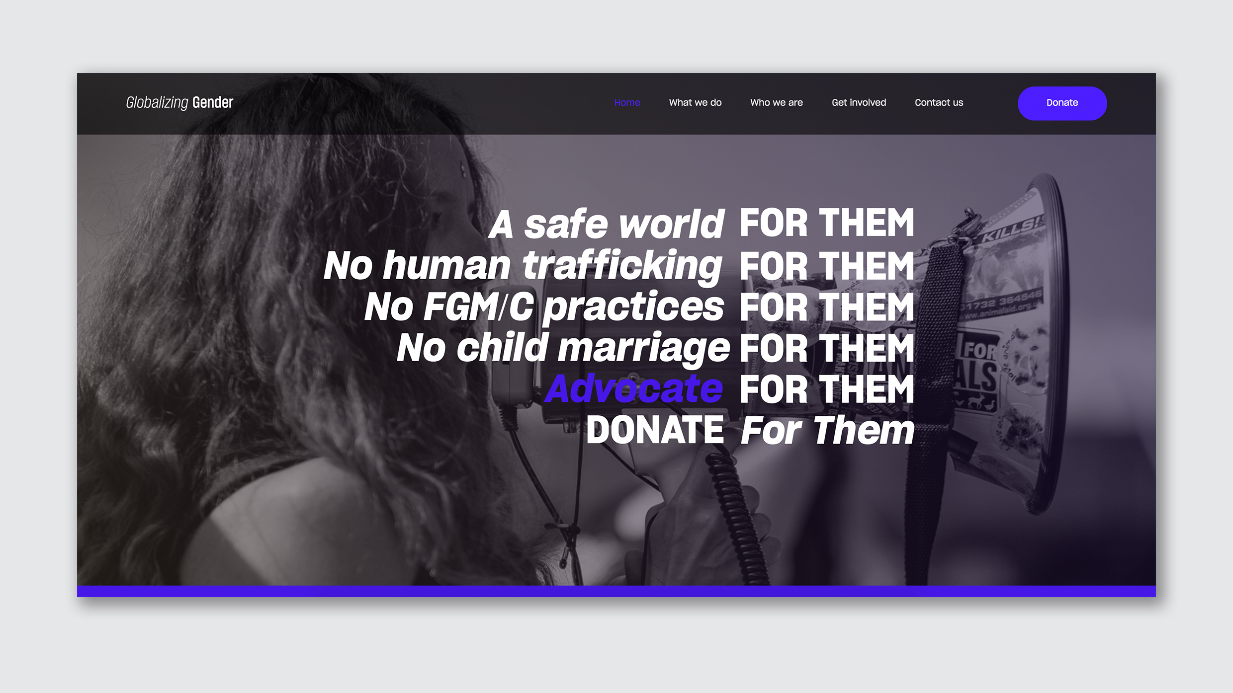
The new design literally spells out all of these issues almost like a protest chant. The refrains are written over an image of a woman with a bullhorn with a restrained color scheme of black and white and purple. Logo-wise, the name of the group is now spelled out; the word “globalizing” is italicized while the term “gender” gets bolded. Tong says that the italics are meant to show a sense of motion—that this is a worldwide movement—while the bold font makes clear that the key issue is gender.
“I think being consistent, making things a little bit more streamlined and in line with a purposeful look and feel, is a way that these nonprofits are actually meeting their goals.”
